![]()
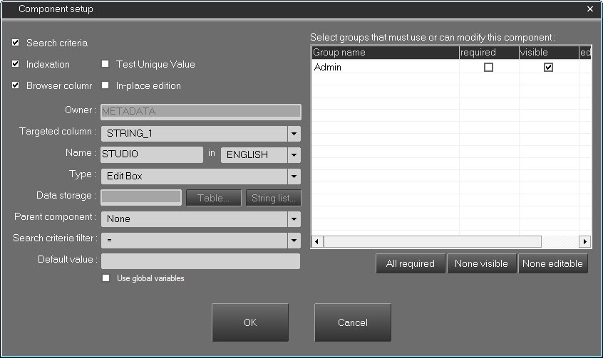
Search criteria : The component appears as a search criteria in the Browser
![]()
Indexation : The component appears as an index card element in the database
![]()
Test Unique Value : activates the unicity test on the value entered in the field
![]()
Browser column : The component appears as a clone which will be visible in the Browser
![]()
In-place edition : Allows the modification of the field directly into the Browser.
![]()
Owner : Name of the dynamic tab the component is linked with
![]()
Targeted column : Selection of the target column in the T_ITEM table
NOTE : the full text and global search modes on the following targeted columns - " $GLOBAL " and " $FULLTEXT ", work only with components of the "Edit Box" and "Combo Box" type.
![]()
Name : Name of the component in the chosen language
![]()
In : Language selection

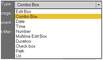
Type : Component types
oEdit Box : editing field, simple line, alphanumerical characters
oCombo box : Multiple-choice list and populating field if this component is modifiable.
oDate : calendar field type
oTime : hour field type
oNumber : Field dedicated to numeric values only
oMulti-line Edit Box : editing field spread over various lines
oDuration : Length field with a hh/mn/ss format
oCheck Box : box to tick
oPath : complete path to a file
oUrl : complete file to a Url
oStatus : box to tick type of field
oMultiComboBox : Multiple choices list with the possibilty to choose between several values from the list
oFlag : boolean field. When selected, an "Import icon" button is shown in order to select a specific icon.
o
![]()
The icon must be a .png file and no more than 256x256.
![]()
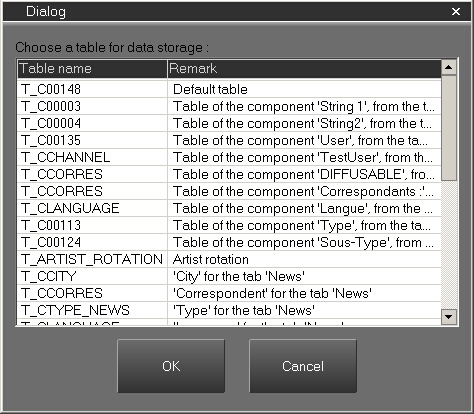
Table : Button to select the table where the component information will be stored. This option is only available for combo-box component types.
This option allows people to create views (aliases) on a table belonging to the ABC8 database.
Dialog window : Selection of the data storage table.

![]()
Data storage : Name of the table (View) in which the data are stored.
![]()
Parent component : Link between combo-boxes (Father-son relationship)
If a Combo Box has a parent component, only the strings that are dependents on the selected string in the parent combo-box will be visible in the list. If no string has been selected in the parent combo-box, all the strings will be visible.
WARNING : if two combo-boxes linked together are set as "indexing" element, it is strongly recommended to associate the "Must use" right to those boxes.
![]()
Search criteria filter : Search filter
For the string of characters (= strictly equals to, LIKE similar to)
For figures and dates (<=, >=, =)
Default value : By default value to assign in the field depending on its type
Use global variables : Use of global variables when the bow to tick is selected.
Select groups that must use or can modify this component : Selection of groups of users who can use or modify the components

Required : Required input fields for indexing in the database.
Visible : Lets you see the component for a given group.
Editable : Modify the component for a given group.
![]()
![]()
All/Non required :Button to assign or remove all rights for all groups.
![]()
![]()
All/None visible : Button to assign or remove all visibility rights for the field for all groups.
![]()
![]()
All/None editable : Button to assign or remove all rights for all groups to add or edit an index field for combo boxes.
![]()
OK : Validation button
![]()
Cancel : Cancel button